Originally Posted by
IBobi
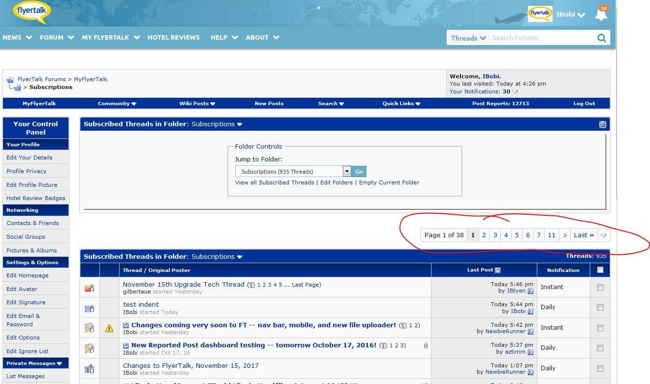
The size of this page selector is relative to your screen resolution. The smaller the screen, the bigger each element must be, to be at least usable.
This is how it looks for me on Chrome, desktop -- just fine.
I'm using a 15" Retina MBP with 2880 x 1800 resolution...
The text should not wrap into two levels at a reasonable amount of browser zoom, it is a design flaw. There is plenty of lateral space remaining, it does not have to wrap.
If you doubt this, find a Retina MacBook Pro, which I'm sure are well represented among your userbase, and try to read the new FT at 100% zoom. With the laptop in my lap it's like trying to read a newspaper at full arms' length.