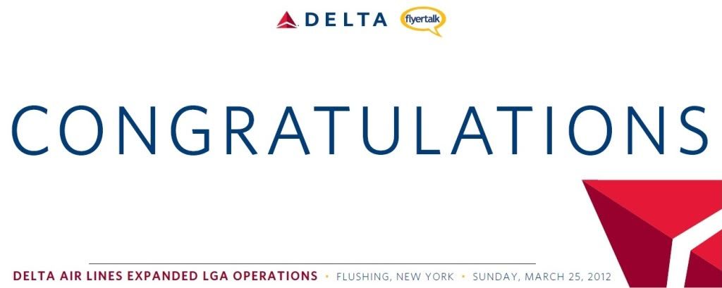
Canarsie (who was one of the ATL-DO organizers) totally came through and put together this banner for us!
Tentatively it will be 2' x 5' and people will get a chance to sign during the lunch. I am going to insist that people sign BELOW the word "Congratulations" so it keeps a "clean/organized" look to it....
What do people think?
One issue is that according to Delta's standards the word "CONGRATULATIONS" should actually be spread out so that the first letter and the last letter are slightly cropped/cut-off at the edge of the banner.
I personally think this would make it look like a printing error...BUT those of us who have been around enough Delta branding will recognize that as their style... Do people like it the way it is or should we go with the cropped version?
Comments?