


New Flight Results Layout on United
 Dec 31, 2020, 7:51 am
#1
Original Poster
Join Date: Dec 2020
Posts: 1
New Flight Results Layout on United
Has anyone noticed a new flight result layout on united.com recently? It reminds me a lot of the old United search result layout, the 2 column view format, prior to the Continental merger. It doesn't appear often and can't figure out what triggers it to appear this way. I have a screenshot I'd share but I'm too new to be able to upload it. I wonder if anyone else has seen this and if they are thinking of permanently updating the site to this view and getting rid of the current view. I just found this interesting and my apologies if this was discussed prior, but didn't see any recent discussions.
 Dec 31, 2020, 10:18 am
#3
FlyerTalk Evangelist


Join Date: Jun 2010
Location: TOA
Programs: HH Diamond, Marriott LTPP/Platinum Premier, Hyatt Lame-ist, UA !K
Posts: 20,061
Has anyone noticed a new flight result layout on united.com recently? It reminds me a lot of the old United search result layout, the 2 column view format, prior to the Continental merger. It doesn't appear often and can't figure out what triggers it to appear this way. I have a screenshot I'd share but I'm too new to be able to upload it. I wonder if anyone else has seen this and if they are thinking of permanently updating the site to this view and getting rid of the current view. I just found this interesting and my apologies if this was discussed prior, but didn't see any recent discussions.
Did a few searches just now but not seeing any result layout differences vs. a few days ago. Would be interesting when you've had enough posts for you to post the screenshot to see the layout that you are verbally describing.
David
 Dec 31, 2020, 11:59 am
#5
FlyerTalk Evangelist
Join Date: Jun 2010
Location: TOA
Programs: HH Diamond, Marriott LTPP/Platinum Premier, Hyatt Lame-ist, UA !K
Posts: 20,061
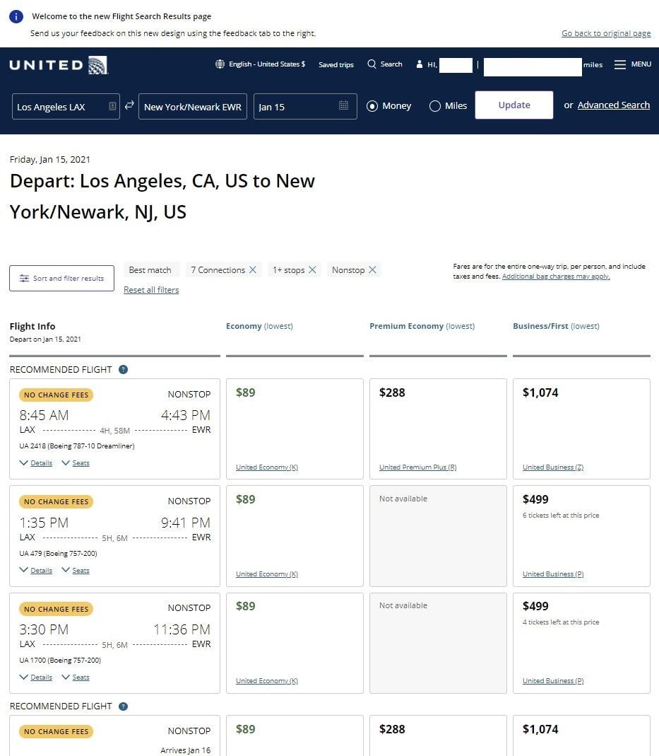
Interesting. Looks like UA's programmers/UX folks are looking for feedback (at the top of the page as shown in your screenshot).
Compared to the current "original" or "standard" search results, info for the Economy (cancel anytime) column is not shown.
I also marvel at why they've crammed all of the flight data into one box/cell and have gobs of white space/empty nada for the prices. Nice that they show the applicable fare class for a given fare cost.
Too bad you still have to select "Details" instead of simply showing the remaining flight data.
David
Dec 31, 2020, 1:07 pm
#6
Join Date: Nov 2008
Posts: 403
The other day when I tried to book they were presenting options with outbound in left column and return in right column on single screen. Each with their prices. Way cool, hope they choose that one. I'm sorry I was too busy to post about it then.
Dec 31, 2020, 3:38 pm
#7
FlyerTalk Evangelist
Join Date: Sep 2002
Location: Between AUS, EWR, and YTO In a little twisty maze of airline seats, all alike.. but I wanna go home with the armadillo
Programs: CO, NW, & UA forum moderator emeritus
Posts: 35,387
The new layout is SUPER annoying. It's hard to actually search for flights because they have so much white space on the screen. When  pening seat maps and flight detail it gets worse.
pening seat maps and flight detail it gets worse.
Dec 31, 2020, 3:47 pm
#8
FlyerTalk Evangelist
Join Date: Jun 2010
Location: TOA
Programs: HH Diamond, Marriott LTPP/Platinum Premier, Hyatt Lame-ist, UA !K
Posts: 20,061
Also, for those who are getting the "new" layout, is it only when you're logged into your MP account and doing the search? I've done a few searches not logged in and do not get that layout (and not gonna login so then the website gets to nag me about not having booked crap to EWR or wherever or that I could use my $113 in ETC value to go to Podunk).
David
David
Jan 3, 2021, 10:17 am
#9
FlyerTalk Evangelist
Join Date: Oct 2003
Location: Floating around
Programs: UA 1K (1MM), DL Gold (1MM), Marriott LTT
Posts: 10,337
I'm getting the new layout completely randomly. And I search tickets every single day. And I'm never logged in when I do the searches.
Just now I got the original layout. I've yet to see the layout where outbound and return are shown on the same screen as referenced above. But then again, I'm also one of the few who consistently gets the "edit search" button at the top of the search results page instead of being able to modify my airports/dates right on that screen. I believe it has to do with screen layout size. Since I don't currently use a widescreen display I wonder if that's the reason.
I'm also super frustrated by the utter waste of white space on the new results screen.
-RM
Jan 3, 2021, 10:50 am
#10
FlyerTalk Evangelist
Join Date: Aug 2015
Posts: 11,453
Sometimes I get a new layout (same palette / design as the flight search results shown in post above) for the advanced search input page, but so far I have not seen the search results come back with the new layout.
Jan 4, 2021, 2:42 am
#12
Join Date: Jan 2013
Location: Delaware
Programs: UA Mileage Plus, Amtrak Guest Rewards
Posts: 1,393
I agree that there is way too much white space. Also, the font is a bit small. Being in my Mid 40's, I consider myself lucky to be able to read something that small, but it's getting harder by the minute. Bigger and bolded text would be a plus.
Regarding removing the drop box for flight details and just having it display by default, that would cause the left column to have even taller boxes which would have even more white space in the fare boxes. Other than the inventory available in expert mode, I don't see anything that can be relocated into the fare boxes.
Slightly off topic, but about 15 years ago, New Jersey Transit here in NJ hired an outside design company to revamp their public-issued paper rail schedules and the public reaction was very positive. Since rail schedules are grid-like, they did things such as taking the emphasis off of each particular train and transferred it to the stations, since most commuters are more concerned about all trains between A and B than about all of the other stops made by any particular train. My fellow EWR flyers might remember this. I wonder what that type of company would recommend to UA about their website design.

 Jan 17, 2021, 8:33 am
#14
FlyerTalk Evangelist
Join Date: Oct 2003
Location: Floating around
Programs: UA 1K (1MM), DL Gold (1MM), Marriott LTT
Posts: 10,337
I *hate* the new layout. Sometimes I get the side-by-side and sometimes I just get the new layout for outbound and return separately. Either way, they took away the biggest feature I use which is the ability to sort a column of results by price either economy, economy flexible or first. Now you must click the "Sort and filter" button, click the drop down for sort, select how you want to sort and then click apply. Four clicks instead of one. STUPID.
And on top of it there used to be a "use old format" link in the upper-right corner. That's gone as well.
-RM
And on top of it there used to be a "use old format" link in the upper-right corner. That's gone as well.
-RM
Jan 17, 2021, 9:03 am
#15
A FlyerTalk Posting Legend
Join Date: Apr 2013
Location: PHX
Programs: AS 75K; UA 1MM; Hyatt Globalist; Marriott LTP; Hilton Diamond (Aspire)
Posts: 56,424
This actually bothers me less than many of UA's various "enhancements" to the web interface. All the substance I care about is still there.
I actually use the App primarily for searching/booking now, since you can get the inventory right there on the first screen.
You mean like the pre-merger UA display, circa 2010? I guess everything comes around . . . .
I actually use the App primarily for searching/booking now, since you can get the inventory right there on the first screen.
You mean like the pre-merger UA display, circa 2010? I guess everything comes around . . . .