


 Apr 23, 2019, 11:03 pm
Last edit by: WineCountryUA
The �leaked� first shot:
United�s announcement video:
https://twitter.com/united/status/11...525993984?s=20
PDF of the new livery:
https://mma.prnewswire.com/media/876...jpg?p=original
United�s announcement video:
https://twitter.com/united/status/11...525993984?s=20
PDF of the new livery:
https://mma.prnewswire.com/media/876...jpg?p=original
Out with the Gold, in with the Blue - United Airlines Unveils its Next Fleet Paint Design
Updated aircraft livery is the next step in United's ongoing efforts to modernize its visual brand
CHICAGO, April 24, 2019 /PRNewswire/ -- Today, United Airlines is introducing customers and employees to a modernized aircraft livery, which will bring a refreshed look to its fleet. The design is a visual representation of United's ongoing brand evolution while staying true to the history it has developed over the past 93 years of proudly serving customers around the world.
"As we improve and elevate our customer experience, we are changing the way people think and feel about United, and this branding captures that new spirit," said Oscar Munoz, CEO of United Airlines. "Each improvement we've added to our service advances our evolution as an airline, furthering our effort to elevate and redefine customer service in the sky. This modernized design, especially our iconic globe, enhances the very best of United's image and values while pointing in the direction of where we intend to go next in serving our customers."
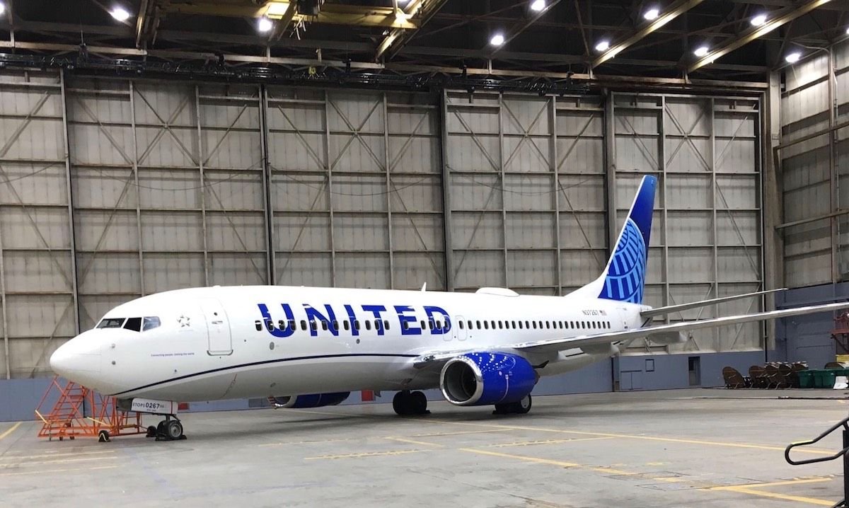
The next iteration of United's livery prominently features the color most connected to the airline's core � blue. Three shades � Rhapsody Blue, United Blue and Sky Blue � are used throughout the design in a way that pays respect to United's heritage while bringing a more modern energy. The airline is keeping its iconic globe logo on the aircraft tail, which represents the carrier's expansive route network of reaching 355 destinations in nearly 60 countries. The tail will be updated with a gradient in the three shades of blue, while the logo will now appear predominantly in Sky Blue. The engines and wingtips are also being painted United Blue, and the swoop that customers and employees have expressed fondness for on United's Dreamliner fleet will be added to all aircraft in Rhapsody Blue. United's name will appear larger on the aircraft body and the lower half of the body will be painted Runway Gray. United's mission of "Connecting people. Uniting the world." will also be painted near the door of each aircraft.
The new design features core colors from United's updated brand palette, which was introduced last year as a step toward updating the brand's visual identity. Blue continues to be the airline's primary color, with various tones creating more depth and reflecting the colors customers and employees see when they look out the plane window at the sky. The airline's new color palette also includes shades of purple, which is most recognizable as the color of the new United Premium Plus seats are being added to the fleet. When combined, the purple and blue tones create a soothing environment and a more relaxed travel experience. In updating its colors, United is reducing the use of gold, which was added to the brand palette almost 30 years ago. United's new color palette can also be seen in the accent colors of the new uniforms that are being created for more than 70,000 front-line employees.
On average, United aircraft receive new paint jobs every seven years. The first aircraft painted with the new design is a Boeing 737-800, which will be joined by a mix of narrowbody, widebody and regional aircraft with the updated livery throughout the year. For more information visit united.com/brandevolution.
Updated aircraft livery is the next step in United's ongoing efforts to modernize its visual brand
CHICAGO, April 24, 2019 /PRNewswire/ -- Today, United Airlines is introducing customers and employees to a modernized aircraft livery, which will bring a refreshed look to its fleet. The design is a visual representation of United's ongoing brand evolution while staying true to the history it has developed over the past 93 years of proudly serving customers around the world.
"As we improve and elevate our customer experience, we are changing the way people think and feel about United, and this branding captures that new spirit," said Oscar Munoz, CEO of United Airlines. "Each improvement we've added to our service advances our evolution as an airline, furthering our effort to elevate and redefine customer service in the sky. This modernized design, especially our iconic globe, enhances the very best of United's image and values while pointing in the direction of where we intend to go next in serving our customers."
The next iteration of United's livery prominently features the color most connected to the airline's core � blue. Three shades � Rhapsody Blue, United Blue and Sky Blue � are used throughout the design in a way that pays respect to United's heritage while bringing a more modern energy. The airline is keeping its iconic globe logo on the aircraft tail, which represents the carrier's expansive route network of reaching 355 destinations in nearly 60 countries. The tail will be updated with a gradient in the three shades of blue, while the logo will now appear predominantly in Sky Blue. The engines and wingtips are also being painted United Blue, and the swoop that customers and employees have expressed fondness for on United's Dreamliner fleet will be added to all aircraft in Rhapsody Blue. United's name will appear larger on the aircraft body and the lower half of the body will be painted Runway Gray. United's mission of "Connecting people. Uniting the world." will also be painted near the door of each aircraft.
The new design features core colors from United's updated brand palette, which was introduced last year as a step toward updating the brand's visual identity. Blue continues to be the airline's primary color, with various tones creating more depth and reflecting the colors customers and employees see when they look out the plane window at the sky. The airline's new color palette also includes shades of purple, which is most recognizable as the color of the new United Premium Plus seats are being added to the fleet. When combined, the purple and blue tones create a soothing environment and a more relaxed travel experience. In updating its colors, United is reducing the use of gold, which was added to the brand palette almost 30 years ago. United's new color palette can also be seen in the accent colors of the new uniforms that are being created for more than 70,000 front-line employees.
On average, United aircraft receive new paint jobs every seven years. The first aircraft painted with the new design is a Boeing 737-800, which will be joined by a mix of narrowbody, widebody and regional aircraft with the updated livery throughout the year. For more information visit united.com/brandevolution.

Revised UA livery revealed 24 April 2019 (sneak peek on FT on 23rd)
May 13, 2019, 9:24 pm
#376
Join Date: Nov 2014
Location: USA
Programs: UA Gold, Marriott Gold
Posts: 1,194
 May 23, 2019, 9:25 pm
#377
Join Date: Aug 2008
Location: DCA, IAD (not BWI if I can help it)
Programs: UA 1MM 1K, Marriott Gold, Hyatt Explorist, status-free on AA, AS, B6, DL, WN, Amtrak, etc.
Posts: 1,481
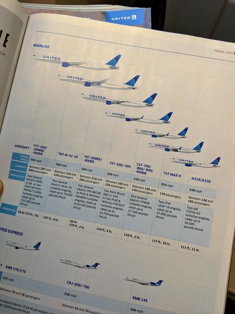
The June edition of Hemispheres has the new livery on the plane-info page, and for some reason they'd already tucked that issue into the seat-back pockets on the CR7 I took from YYZ to IAD tonight.
(Yes, I am also wondering why they'd still want to include a separate entry for the 737 MAX 9.)
(Yes, I am also wondering why they'd still want to include a separate entry for the 737 MAX 9.)
May 23, 2019, 9:35 pm
#378
Join Date: Jul 2012
Location: Chicago
Posts: 1,161
From what I remember in 2008, the airline would�ve still been United in Chicago and CO being acquired. Whether we still had a Tulip or not, I don�t know, but I feel like this hideous mess was all Jeff. The CO execs can cry all they wanted, United Airlines and the United Airlines �U� logo were more well known around the world than CO and some generic clip art tumor. It�s why Oscar Munoz is not the person who should be CEO - he has ties to CO...and he�s basically Jeff with a better smile, IMO.
They did give up more leverage in the two years, since UA has way more power than the proposed 2008 merger. If they had waited until 2012, it would�ve been a complete takeover of CO. Smisek was already slashing things and CO had already been on a steady 6 year side, and coasting on their reputation. There was also long term debt that was due in 2011 and aircraft orders they didn�t have financing all sewn up for.
Maybe if Scott Kirby ever becomes CEO he�ll want to stamp his own look on this thing with his own logo and livery. It can�t get any worse, right? Right?
May 24, 2019, 12:21 am
#379
Join Date: Dec 2017
Posts: 490
The June edition of Hemispheres has the new livery on the plane-info page, and for some reason they'd already tucked that issue into the seat-back pockets on the CR7 I took from YYZ to IAD tonight.
(Yes, I am also wondering why they'd still want to include a separate entry for the 737 MAX 9.)
(Yes, I am also wondering why they'd still want to include a separate entry for the 737 MAX 9.)
 May 24, 2019, 6:54 am
#381
Join Date: Apr 2005
Location: MBS/FNT/LAN
Programs: UA 1K, HH Gold, Mariott Gold
Posts: 9,630
Sorry if this had been addressed before.... But why not re-paint the MAX planes while they sit?
 May 24, 2019, 7:16 am
#382
FlyerTalk Evangelist
Join Date: Mar 2010
Location: DAY
Programs: UA 1K 1MM; Marriott LT Titanium; Amex MR; Chase UR; Hertz PC; Global Entry
Posts: 10,159
Most likely, they are using the new livery when planes come due for a re-paint. It is such a mild change, I doubt they will spend funds to paint planes before they come due naturally.
May 24, 2019, 8:01 am
#384
Moderator: Budget Travel forum & Credit Card Programs, FlyerTalk Evangelist
Join Date: Aug 2002
Location: YYJ/YVR and back on Van Isle ....... for now
Programs: UA lifetime MM / *A Gold
Posts: 14,428
May 24, 2019, 8:26 am
#385
Join Date: Feb 2008
Programs: 6 year GS, now 2MM Jeff-ugee, *wood LTPlt, SkyPeso PLT
Posts: 6,526
That's an interesting interpretation trying to link Tilton to this to soften the blow...the reality is Smisek advocated for the Continental name to stay, Tilton said Chicago WHQ and the United name had to stay and initially guided Smisek to keep the entire brand. The frankenstein brand was entirely a creation of Smisek and his lieutenants who knew that they had little leverage in getting Tilton to change those demands, as CO would have little chance at independent survival in a land of UA/US - so they blinked but wanted something out of it, so made a petty demand to keep their branding - it turned out to represent the utter incompetence that the integration would later become.
Lastly, the proposed DL/UA discussions Tilton made 2005-2009, the same demands to the DL side - UA name, Chicago WHQ...in 2006-2008 during the first CO talks, United was prepared to let both of go - The CO side's hubris mean't they didn't get that chance in 2009 when UAL Corp. had the upper hand (and ultimately end up acquiring Continental).
Lastly, the proposed DL/UA discussions Tilton made 2005-2009, the same demands to the DL side - UA name, Chicago WHQ...in 2006-2008 during the first CO talks, United was prepared to let both of go - The CO side's hubris mean't they didn't get that chance in 2009 when UAL Corp. had the upper hand (and ultimately end up acquiring Continental).
Strategy was blow away by other airlines (primarily Delta, but also international carriers) not going to the third word service/product standards pushed by Jeff.
But on the new liverary. (1) its far better then the cheap and pointless, not to mention ugly CO livery that UA is currently using. (2) To the extent that United is going to retain the globe, they did as much as possible to make it generic, not the old clip art logo. I actually think there is an effort to do a nod to the much better UA tulip logo. (3) I am not a fan of the size of font used for United. Agree it would have been better to make it even bigger so as to avoid the bullet hole look.
Last edited by WineCountryUA; May 24, 2019 at 3:33 pm Reason: OT content removed
May 24, 2019, 9:47 am
#386
Join Date: Nov 2007
Location: Colorado
Programs: UA Gold (.85 MM), HH Diamond, SPG Platinum (LT Gold), Hertz PC, National EE
Posts: 5,656
The June edition of Hemispheres has the new livery on the plane-info page, and for some reason they'd already tucked that issue into the seat-back pockets on the CR7 I took from YYZ to IAD tonight.
(Yes, I am also wondering why they'd still want to include a separate entry for the 737 MAX 9.)
(Yes, I am also wondering why they'd still want to include a separate entry for the 737 MAX 9.)
May 24, 2019, 10:38 am
#387
Join Date: Feb 2002
Location: NYC: UA 1K, DL Platinum, AAirpass, Avis PC
Posts: 4,599
They chose the UA brand...
For frequent flyers they kept the MileagePlus, Economy Plus, and for a while P.S. brands as well.
A logo or paint job isn't a brand - it's one of many elements. People shop using the name of the brand - if it was the logo that they used to shop then AA's radical change throwing away years of equity in the AA emblem would have tanked online sales the week they changed over the logo online.
Much as you will hear airline execs mention TV ads are for employee morale as much as anything the paint jobs have the most effect on them and I think appeasing both sides of the employee groups was the driver of what paint job the planes got at merger time.
I like the first peek at the UA Express livery DCA Writer posted. Looks more sophisticated than the garish billboard titles from HP on the mainline craft.
There is a lot of revisionist history given how badly the CO management team performed, and how much brand damage Smisik did before he was driven out for corruption. The reality was that CO was a regional carrier. For some in NY it was well liked, and for some it was the "new jersey airline" but it has very little presence internationally, and its over use of crappy RJs had done major damage to the brand that Gordo had built. There was no way that it had the brand pull in any respect that UA had. Yes, UA's brand was tarnished, but had far more value. Smisik basically squandered the chance to combine the UA brand (better known) with the CO reputation (better service). Instead of building a leading airline, he tried to follow the Hunter Keay Playbook of taking as much away as possible in service/product and then milk the capacity cuts.
Strategy was blow away by other airlines (primarily Delta, but also international carriers) not going to the third word service/product standards pushed by Jeff.
But on the new liverary. (1) its far better then the cheap and pointless, not to mention ugly CO livery that UA is currently using. (2) To the extent that United is going to retain the globe, they did as much as possible to make it generic, not the old clip art logo. I actually think there is an effort to do a nod to the much better UA tulip logo. (3) I am not a fan of the size of font used for United. Agree it would have been better to make it even bigger so as to avoid the bullet hole look.
But all in all, and improvement. Alas no logo is going to compensate for 10x on the 777 or narrow uncomfortable seats and crappy bathrooms on all of the 737s.
Last edited by cerealmarketer; May 24, 2019 at 10:48 am Reason: Wrong poster name
May 24, 2019, 10:52 am
#388
FlyerTalk Evangelist
Join Date: Aug 2015
Posts: 11,461
May 24, 2019, 10:57 am
#389
Join Date: Nov 2007
Location: Colorado
Programs: UA Gold (.85 MM), HH Diamond, SPG Platinum (LT Gold), Hertz PC, National EE
Posts: 5,656
Hopefully not just being pedantic, but I think we're looking at cruise speed, rather than max speed, and I think the wingspan differences are down to winglets (split scimitar vs MAX AT), although Hemispheres drawing makes them look the same.
May 24, 2019, 11:32 am
#390
FlyerTalk Evangelist
Join Date: Jul 1999
Location: ORD/MDW
Programs: BA/AA/AS/B6/WN/ UA/HH/MR and more like 'em but most felicitously & importantly MUCCI
Posts: 19,719
Smisik basically squandered the chance to combine the UA brand (better known) with the CO reputation (better service). Instead of building a leading airline, he tried to follow the Hunter Keay Playbook of taking as much away as possible in service/product and then milk the capacity cuts.
Strategy was blown away by other airlines (primarily Delta, but also international carriers) not going to the third word service/product standards pushed by Jeff.
Strategy was blown away by other airlines (primarily Delta, but also international carriers) not going to the third word service/product standards pushed by Jeff.
As for this new livery, I think UA needs a clean break with the merger years to drive consumer re-sampling, and this ain't it. It's cautious and small. Then again I would prefer to hold off on any brand refresh until the company itself is refreshed and has something to celebrate, which I don't see at this point. Shades of the ill-fated "United Rising" image campaign launched amid labor acrimony and the 2000 Summer From Hell meltdown. Nothing "Rising" about it.