


 Apr 23, 2019, 11:03 pm
Last edit by: WineCountryUA
The �leaked� first shot:
United�s announcement video:
https://twitter.com/united/status/11...525993984?s=20
PDF of the new livery:
https://mma.prnewswire.com/media/876...jpg?p=original
United�s announcement video:
https://twitter.com/united/status/11...525993984?s=20
PDF of the new livery:
https://mma.prnewswire.com/media/876...jpg?p=original
Out with the Gold, in with the Blue - United Airlines Unveils its Next Fleet Paint Design
Updated aircraft livery is the next step in United's ongoing efforts to modernize its visual brand
CHICAGO, April 24, 2019 /PRNewswire/ -- Today, United Airlines is introducing customers and employees to a modernized aircraft livery, which will bring a refreshed look to its fleet. The design is a visual representation of United's ongoing brand evolution while staying true to the history it has developed over the past 93 years of proudly serving customers around the world.
"As we improve and elevate our customer experience, we are changing the way people think and feel about United, and this branding captures that new spirit," said Oscar Munoz, CEO of United Airlines. "Each improvement we've added to our service advances our evolution as an airline, furthering our effort to elevate and redefine customer service in the sky. This modernized design, especially our iconic globe, enhances the very best of United's image and values while pointing in the direction of where we intend to go next in serving our customers."
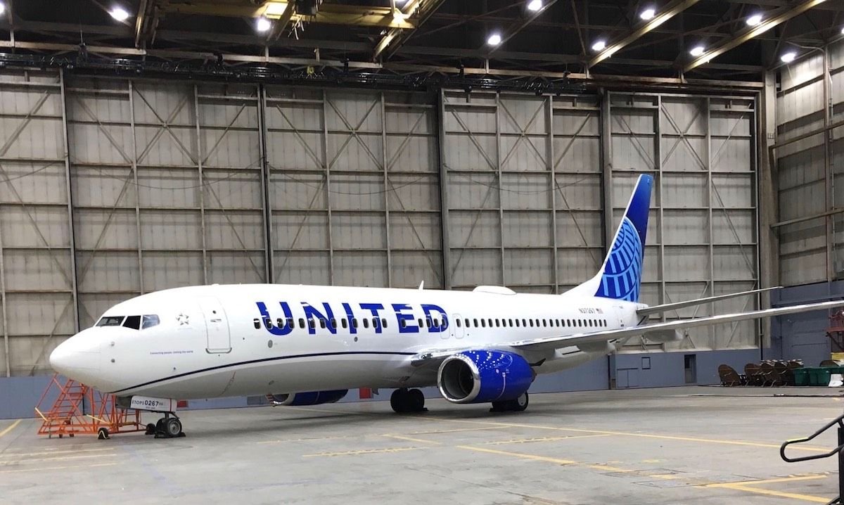
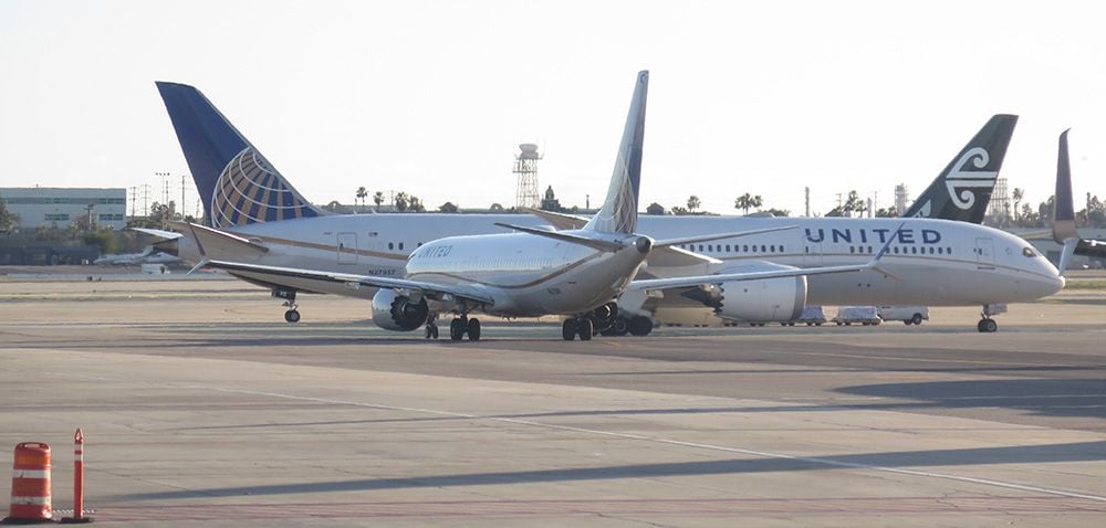
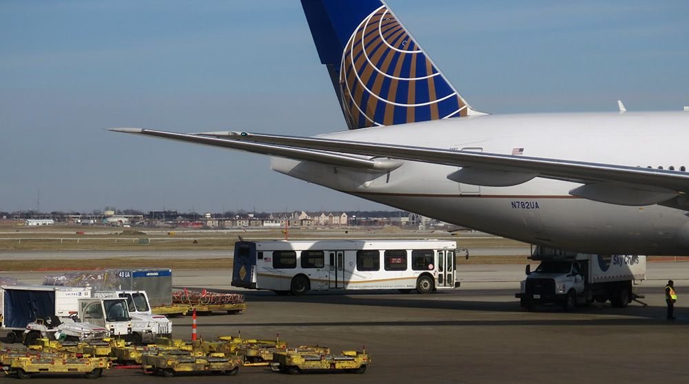
The next iteration of United's livery prominently features the color most connected to the airline's core � blue. Three shades � Rhapsody Blue, United Blue and Sky Blue � are used throughout the design in a way that pays respect to United's heritage while bringing a more modern energy. The airline is keeping its iconic globe logo on the aircraft tail, which represents the carrier's expansive route network of reaching 355 destinations in nearly 60 countries. The tail will be updated with a gradient in the three shades of blue, while the logo will now appear predominantly in Sky Blue. The engines and wingtips are also being painted United Blue, and the swoop that customers and employees have expressed fondness for on United's Dreamliner fleet will be added to all aircraft in Rhapsody Blue. United's name will appear larger on the aircraft body and the lower half of the body will be painted Runway Gray. United's mission of "Connecting people. Uniting the world." will also be painted near the door of each aircraft.
The new design features core colors from United's updated brand palette, which was introduced last year as a step toward updating the brand's visual identity. Blue continues to be the airline's primary color, with various tones creating more depth and reflecting the colors customers and employees see when they look out the plane window at the sky. The airline's new color palette also includes shades of purple, which is most recognizable as the color of the new United Premium Plus seats are being added to the fleet. When combined, the purple and blue tones create a soothing environment and a more relaxed travel experience. In updating its colors, United is reducing the use of gold, which was added to the brand palette almost 30 years ago. United's new color palette can also be seen in the accent colors of the new uniforms that are being created for more than 70,000 front-line employees.
On average, United aircraft receive new paint jobs every seven years. The first aircraft painted with the new design is a Boeing 737-800, which will be joined by a mix of narrowbody, widebody and regional aircraft with the updated livery throughout the year. For more information visit united.com/brandevolution.
Updated aircraft livery is the next step in United's ongoing efforts to modernize its visual brand
CHICAGO, April 24, 2019 /PRNewswire/ -- Today, United Airlines is introducing customers and employees to a modernized aircraft livery, which will bring a refreshed look to its fleet. The design is a visual representation of United's ongoing brand evolution while staying true to the history it has developed over the past 93 years of proudly serving customers around the world.
"As we improve and elevate our customer experience, we are changing the way people think and feel about United, and this branding captures that new spirit," said Oscar Munoz, CEO of United Airlines. "Each improvement we've added to our service advances our evolution as an airline, furthering our effort to elevate and redefine customer service in the sky. This modernized design, especially our iconic globe, enhances the very best of United's image and values while pointing in the direction of where we intend to go next in serving our customers."
The next iteration of United's livery prominently features the color most connected to the airline's core � blue. Three shades � Rhapsody Blue, United Blue and Sky Blue � are used throughout the design in a way that pays respect to United's heritage while bringing a more modern energy. The airline is keeping its iconic globe logo on the aircraft tail, which represents the carrier's expansive route network of reaching 355 destinations in nearly 60 countries. The tail will be updated with a gradient in the three shades of blue, while the logo will now appear predominantly in Sky Blue. The engines and wingtips are also being painted United Blue, and the swoop that customers and employees have expressed fondness for on United's Dreamliner fleet will be added to all aircraft in Rhapsody Blue. United's name will appear larger on the aircraft body and the lower half of the body will be painted Runway Gray. United's mission of "Connecting people. Uniting the world." will also be painted near the door of each aircraft.
The new design features core colors from United's updated brand palette, which was introduced last year as a step toward updating the brand's visual identity. Blue continues to be the airline's primary color, with various tones creating more depth and reflecting the colors customers and employees see when they look out the plane window at the sky. The airline's new color palette also includes shades of purple, which is most recognizable as the color of the new United Premium Plus seats are being added to the fleet. When combined, the purple and blue tones create a soothing environment and a more relaxed travel experience. In updating its colors, United is reducing the use of gold, which was added to the brand palette almost 30 years ago. United's new color palette can also be seen in the accent colors of the new uniforms that are being created for more than 70,000 front-line employees.
On average, United aircraft receive new paint jobs every seven years. The first aircraft painted with the new design is a Boeing 737-800, which will be joined by a mix of narrowbody, widebody and regional aircraft with the updated livery throughout the year. For more information visit united.com/brandevolution.

Revised UA livery revealed 24 April 2019 (sneak peek on FT on 23rd)
Mar 9, 2019, 11:20 am
#62
Join Date: Jul 2009
Location: WAS
Programs: UA Silver, Marriott Gold, IHG Silver, Hilton Silver, Hertz PC, National Exec Elite, Avis PC
Posts: 1,290
I thought the meatball referred to the gold-red tail of pre-1991 CO. Maybe as part of the repainting they bring in retrojets with that logo and even more with the Saul Bass tulip would be nice. I think there are 757/767s still flying that actually wore it ~30 years ago.
 Mar 9, 2019, 11:22 am
#63
FlyerTalk Evangelist

Join Date: Apr 2003
Location: Honolulu, Hawaiʻi [+MKK4 EBBER R577 EDSEL R577 ELKEY EXERT]
Posts: 15,826
Mar 9, 2019, 12:46 pm
#64
Join Date: Mar 2019
Programs: Mileage Plus
Posts: 1
Every time I'm taking pictures of planes on approach/landing, for a United plane I can't look at the tail. If I do, I think I messed up the shot every time.
I mean I normally mess up the shot anyway, but the United tail is unreliable because it always looks blurred.
I mean I normally mess up the shot anyway, but the United tail is unreliable because it always looks blurred.
Mar 9, 2019, 3:44 pm
#66
FlyerTalk Evangelist
Join Date: Feb 2003
Location: Denver, CO, USA
Programs: Sometimes known as [ARG:6 UNDEFINED]
Posts: 26,694
 Mar 9, 2019, 4:04 pm
#67
A FlyerTalk Posting Legend
Join Date: Apr 2013
Location: PHX
Programs: AS 75K; UA 1MM; Hyatt Globalist; Marriott LTP; Hilton Diamond (Aspire)
Posts: 56,453
When I think of the top ten things I wish UA would spend some money on, "rebranding" does not make the list.
A new branding strategy is not going to make me buy more UA tickets. Improved meals on board, restoring crew on Polaris flights, improved food in the UCs, better upgrade opportunities, and cleaner aircraft (among other things) would.
A new branding strategy is not going to make me buy more UA tickets. Improved meals on board, restoring crew on Polaris flights, improved food in the UCs, better upgrade opportunities, and cleaner aircraft (among other things) would.
Mar 9, 2019, 4:46 pm
#68
FlyerTalk Evangelist
Join Date: Mar 2010
Location: DAY
Programs: UA 1K 1MM; Marriott LT Titanium; Amex MR; Chase UR; Hertz PC; Global Entry
Posts: 10,159
When I think of the top ten things I wish UA would spend some money on, "rebranding" does not make the list.
A new branding strategy is not going to make me buy more UA tickets. Improved meals on board, restoring crew on Polaris flights, improved food in the UCs, better upgrade opportunities, and cleaner aircraft (among other things) would.
A new branding strategy is not going to make me buy more UA tickets. Improved meals on board, restoring crew on Polaris flights, improved food in the UCs, better upgrade opportunities, and cleaner aircraft (among other things) would.
But re-branding isn't on my top ten list either.....
 Mar 9, 2019, 5:02 pm
#69
Join Date: May 2013
Posts: 3,361
The current livery is sufficient in terms of minimal colors and simplified painting effort, certainly in comparison to other airlines. There is no value in redoing the branding at this point given the almost endless list of other priorities that need addressing before tackling something with absolutely zero usefulness.
Last edited by WineCountryUA; Mar 9, 2019 at 5:28 pm Reason: Discuss the issues, not the poster(s)
Mar 9, 2019, 6:06 pm
#70
A FlyerTalk Posting Legend
Join Date: Sep 2002
Location: LAX/TPE
Programs: United 1K, JAL Sapphire, SPG Lifetime Platinum, National Executive Elite, Hertz PC, Avis PC
Posts: 42,199
Dropping the minutiae of an accent color should not require a major rebranding project - just leave the yellow stripe off aircraft that go in for painting, and at the most, change the tail accent gold stripes to a light gray derived from adding a small amount of dark pigment to the white paint used on the rest of the aircraft.
Neither of these changes really require a rebranding project or an update to the brand beyond queueing up the update to supplemental materials due for re-ordering in the future, and updates to digital photo and video media. There should be little to no incremental cost approaching it this way vs the millions involved in a major rebranding effort with a new logo, typeface and color plan.
Neither of these changes really require a rebranding project or an update to the brand beyond queueing up the update to supplemental materials due for re-ordering in the future, and updates to digital photo and video media. There should be little to no incremental cost approaching it this way vs the millions involved in a major rebranding effort with a new logo, typeface and color plan.
Mar 9, 2019, 6:13 pm
#71
Join Date: Jan 2005
Location: New York, NY
Programs: UA, AA, DL, Hertz, Avis, National, Hyatt, Hilton, SPG, Marriott
Posts: 9,451
As I understand it, the logo stays the same, the typeface stays the same, and the color palette has already been publicly revised. The livery will be consistent with recent marketing efforts, which eschew the gold and feature an updated globe mark (versus the original 1991 tail).
It�s sort of the reverse of what UAL did in ~2000, shifting to the block, sans-serif �U N I T E D� typeface throughout the various touch-points besides livery, with which the updated wordmark was to be compatible.
Mar 9, 2019, 6:58 pm
#72
Join Date: May 2013
Posts: 3,361
Dropping the minutiae of an accent color should not require a major rebranding project - just leave the yellow stripe off aircraft that go in for painting, and at the most, change the tail accent gold stripes to a light gray derived from adding a small amount of dark pigment to the white paint used on the rest of the aircraft.
Neither of these changes really require a rebranding project or an update to the brand beyond queueing up the update to supplemental materials due for re-ordering in the future, and updates to digital photo and video media. There should be little to no incremental cost approaching it this way vs the millions involved in a major rebranding effort with a new logo, typeface and color plan.
Neither of these changes really require a rebranding project or an update to the brand beyond queueing up the update to supplemental materials due for re-ordering in the future, and updates to digital photo and video media. There should be little to no incremental cost approaching it this way vs the millions involved in a major rebranding effort with a new logo, typeface and color plan.
Mar 9, 2019, 11:03 pm
#73
Join Date: Mar 2011
Location: MFR
Programs: UA 1K 1.9MM, Hilton Gold, Marriott Gold
Posts: 2,884
I never understood what a tulip has to do with travel. Keep the globe.
Mar 10, 2019, 12:28 am
#74
FlyerTalk Evangelist
Join Date: Aug 2015
Posts: 11,461
The Wave
Personally I hope they keep the wave through any update. I like it. So far it looks good on the 737 and a 787.
I bet it would look good on everything in the fleet. It even looks good on the (land) bus.

I bet it would look good on everything in the fleet. It even looks good on the (land) bus.