


 Apr 23, 2019, 11:03 pm
Last edit by: WineCountryUA
The �leaked� first shot:
United�s announcement video:
https://twitter.com/united/status/11...525993984?s=20
PDF of the new livery:
https://mma.prnewswire.com/media/876...jpg?p=original
United�s announcement video:
https://twitter.com/united/status/11...525993984?s=20
PDF of the new livery:
https://mma.prnewswire.com/media/876...jpg?p=original
Out with the Gold, in with the Blue - United Airlines Unveils its Next Fleet Paint Design
Updated aircraft livery is the next step in United's ongoing efforts to modernize its visual brand
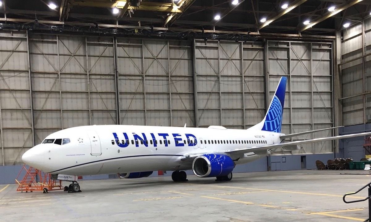
CHICAGO, April 24, 2019 /PRNewswire/ -- Today, United Airlines is introducing customers and employees to a modernized aircraft livery, which will bring a refreshed look to its fleet. The design is a visual representation of United's ongoing brand evolution while staying true to the history it has developed over the past 93 years of proudly serving customers around the world.
"As we improve and elevate our customer experience, we are changing the way people think and feel about United, and this branding captures that new spirit," said Oscar Munoz, CEO of United Airlines. "Each improvement we've added to our service advances our evolution as an airline, furthering our effort to elevate and redefine customer service in the sky. This modernized design, especially our iconic globe, enhances the very best of United's image and values while pointing in the direction of where we intend to go next in serving our customers."
The next iteration of United's livery prominently features the color most connected to the airline's core � blue. Three shades � Rhapsody Blue, United Blue and Sky Blue � are used throughout the design in a way that pays respect to United's heritage while bringing a more modern energy. The airline is keeping its iconic globe logo on the aircraft tail, which represents the carrier's expansive route network of reaching 355 destinations in nearly 60 countries. The tail will be updated with a gradient in the three shades of blue, while the logo will now appear predominantly in Sky Blue. The engines and wingtips are also being painted United Blue, and the swoop that customers and employees have expressed fondness for on United's Dreamliner fleet will be added to all aircraft in Rhapsody Blue. United's name will appear larger on the aircraft body and the lower half of the body will be painted Runway Gray. United's mission of "Connecting people. Uniting the world." will also be painted near the door of each aircraft.
The new design features core colors from United's updated brand palette, which was introduced last year as a step toward updating the brand's visual identity. Blue continues to be the airline's primary color, with various tones creating more depth and reflecting the colors customers and employees see when they look out the plane window at the sky. The airline's new color palette also includes shades of purple, which is most recognizable as the color of the new United Premium Plus seats are being added to the fleet. When combined, the purple and blue tones create a soothing environment and a more relaxed travel experience. In updating its colors, United is reducing the use of gold, which was added to the brand palette almost 30 years ago. United's new color palette can also be seen in the accent colors of the new uniforms that are being created for more than 70,000 front-line employees.
On average, United aircraft receive new paint jobs every seven years. The first aircraft painted with the new design is a Boeing 737-800, which will be joined by a mix of narrowbody, widebody and regional aircraft with the updated livery throughout the year. For more information visit united.com/brandevolution.
Updated aircraft livery is the next step in United's ongoing efforts to modernize its visual brand
CHICAGO, April 24, 2019 /PRNewswire/ -- Today, United Airlines is introducing customers and employees to a modernized aircraft livery, which will bring a refreshed look to its fleet. The design is a visual representation of United's ongoing brand evolution while staying true to the history it has developed over the past 93 years of proudly serving customers around the world.
"As we improve and elevate our customer experience, we are changing the way people think and feel about United, and this branding captures that new spirit," said Oscar Munoz, CEO of United Airlines. "Each improvement we've added to our service advances our evolution as an airline, furthering our effort to elevate and redefine customer service in the sky. This modernized design, especially our iconic globe, enhances the very best of United's image and values while pointing in the direction of where we intend to go next in serving our customers."
The next iteration of United's livery prominently features the color most connected to the airline's core � blue. Three shades � Rhapsody Blue, United Blue and Sky Blue � are used throughout the design in a way that pays respect to United's heritage while bringing a more modern energy. The airline is keeping its iconic globe logo on the aircraft tail, which represents the carrier's expansive route network of reaching 355 destinations in nearly 60 countries. The tail will be updated with a gradient in the three shades of blue, while the logo will now appear predominantly in Sky Blue. The engines and wingtips are also being painted United Blue, and the swoop that customers and employees have expressed fondness for on United's Dreamliner fleet will be added to all aircraft in Rhapsody Blue. United's name will appear larger on the aircraft body and the lower half of the body will be painted Runway Gray. United's mission of "Connecting people. Uniting the world." will also be painted near the door of each aircraft.
The new design features core colors from United's updated brand palette, which was introduced last year as a step toward updating the brand's visual identity. Blue continues to be the airline's primary color, with various tones creating more depth and reflecting the colors customers and employees see when they look out the plane window at the sky. The airline's new color palette also includes shades of purple, which is most recognizable as the color of the new United Premium Plus seats are being added to the fleet. When combined, the purple and blue tones create a soothing environment and a more relaxed travel experience. In updating its colors, United is reducing the use of gold, which was added to the brand palette almost 30 years ago. United's new color palette can also be seen in the accent colors of the new uniforms that are being created for more than 70,000 front-line employees.
On average, United aircraft receive new paint jobs every seven years. The first aircraft painted with the new design is a Boeing 737-800, which will be joined by a mix of narrowbody, widebody and regional aircraft with the updated livery throughout the year. For more information visit united.com/brandevolution.

Revised UA livery revealed 24 April 2019 (sneak peek on FT on 23rd)
Apr 24, 2019, 7:44 am
#256
Join Date: Jan 2005
Location: New York, NY
Programs: UA, AA, DL, Hertz, Avis, National, Hyatt, Hilton, SPG, Marriott
Posts: 9,447
Now, the entire fleet is going to come due for repainting soon, so might as well roll something new. No real cost to this livery change (contrary to popular belief) - this'll get rolled out on new airframes and as older ones come up for their repainting, which has to be done anyway.
IMO, that probably suggests they got it right! I don't think this livery can possibly elicit a strong reaction one way or the other, unless there's some other irrationality at work. One person's "inspiring" design is someone else's nightmare... see CO's Peter Max 777! The consensus seems to be "meh", so at least it's not polarizing.
 Apr 24, 2019, 7:50 am
#257
Join Date: Jan 2003
Location: DEN
Programs: UA 1P-1MM, Marriott LT Titanium
Posts: 3,930
Apr 24, 2019, 8:23 am
#258
FlyerTalk Evangelist
Join Date: Feb 2002
Location: San Francisco/Tel Aviv/YYZ
Programs: CO 1K-MM
Posts: 10,762
Its ok, it would've been better if they used the stylized T (with the diagonals on the horizontal part) as a nod to the real united...
Apr 24, 2019, 8:30 am
#259
Join Date: Mar 2015
Location: Austin, TX - AUS
Programs: AA Platinum, Hilton, Hyatt, IHG, Marriott
Posts: 1,625
I'd rather have UNITED above the windows. Otherwise, the new livery is descent.
Apr 24, 2019, 8:46 am
#260
Join Date: Jun 2006
Posts: 2,628
OK, after sleeping on it, it will probably be fine.
I thought a more minor change of just painting over the gold with purple line, larger title and new tail would make rollout quicker and cheaper - remember UA just repainted a substantial number of aircraft in the past year that will need a repaint into this scheme.
Notes: the title through the window are unnecessary and should be as large as possible to stay above the windows
The purple wave should have gone the length of the aircraft like the 787 livery - purple stopping and starting makes it not look as important or harder to differentiate differences with blue.
Like the grey bottom - rather keep grey engines, but can live with blue - its just such a royal blue and blue engines may make the difference between purple and blue titles harder to differentiate..
Apr 24, 2019, 8:47 am
#261
A FlyerTalk Posting Legend
Join Date: Jun 2005
Posts: 57,554
... because it was cheaper?
The pmUA half of the fleet - sure, those needed to be repainted. But by re-using the CO livery, they only had to paint over the "Continental" and change it to "United". No repainting needed. Hundreds of planes mostly unpainted = $$$.
Now, the entire fleet is going to come due for repainting soon, so might as well roll something new. No real cost to this livery change (contrary to popular belief) - this'll get rolled out on new airframes and as older ones come up for their repainting, which has to be done anyway.
Apr 24, 2019, 8:53 am
#262
Join Date: Jan 2005
Location: New York, NY
Programs: UA, AA, DL, Hertz, Avis, National, Hyatt, Hilton, SPG, Marriott
Posts: 9,447
I think that would be cool, but remember the stylized "T" was to echo the Tulip (or "Flying U", or Shield, or four continental US time zones, or four carriers that made up the first iteration of United... the brilliance of that logo) and without it, there isn't much relevance. It would also require the company's wordmark to be revised across the entire system, which would defeat the "evolutionary" goal of the livery.
Apr 24, 2019, 9:20 am
#263
Join Date: Aug 2010
Location: Morris County, NJ
Programs: UA 1K/*G, Avis Pres, Marriott Plat
Posts: 2,305
They no doubt took the cheap way out - a hallmark of Smisek regime. But the more I look at the new "update," the more I like it. It pays respect to the liveries of both pmUA and pmCO, and adds small design changes that can't be linked to either pm livery. A fresh start, years too late, IMHO.
Most thankfully - even with all the grousing and complaining here at FT - United is a fiscally healthy, profitable airline. Mostly functional, too. They are in much, much better shape today than either airline was in 2010. From a financial health and viability perspective, it's very hard to argue the merger was anything but a success. Bumpy, painful -- absolutely -- but ultimately a success. I'd wager that without it, either United or Continental (or possibly even both) wouldn't exist today.
So now that we've got solid footing - let's paint the planes!
Apr 24, 2019, 9:30 am
#264
FlyerTalk Evangelist
Join Date: May 2007
Location: Houston
Programs: UA Plat, Marriott Gold
Posts: 12,691
A boring evolution with a few minor contemporary updates.
Why are the lines of longitude so fat and with gaps in them? Never understood that before and it doesn't make any more sense now.
Why are the lines of longitude so fat and with gaps in them? Never understood that before and it doesn't make any more sense now.
Apr 24, 2019, 9:32 am
#265
Join Date: Dec 2009
Location: New York, NY
Programs: Hyatt GLOB, Marriott Lifetime PLT, UA 1K 1MM.
Posts: 1,728
IMO, that probably suggests they got it right! I don't think this livery can possibly elicit a strong reaction one way or the other, unless there's some other irrationality at work. One person's "inspiring" design is someone else's nightmare... see CO's Peter Max 777! The consensus seems to be "meh", so at least it's not polarizing.
Apr 24, 2019, 10:31 am
#266
Join Date: Sep 2004
Location: SYD
Programs: UA 1K; VA Gold; QF Gold; HHonors Gold; Marriott Gold; National ExecElite
Posts: 419
This is OK. I like the mock designs that have the tail paint extending all the way to the underside of the fuselage.
But nothing can beat NH's Star Wars liveries.
But nothing can beat NH's Star Wars liveries.
Apr 24, 2019, 10:37 am
#267
Join Date: Nov 2004
Posts: 812
some of the toxic culture inevitably carried over, not that everything was perfect at CAL either.
Apr 24, 2019, 11:08 am
#268
Join Date: Dec 2008
Programs: UA
Posts: 73
Generally I like the updated look. The one critical point is the swoopy line. To me it looks like the plane is frowning.
Apr 24, 2019, 11:30 am
#269
Join Date: May 2012
Location: ORF, RIC
Programs: UA LT 1K, 3 MM; Marriott Titanium; IHG Platinum
Posts: 6,952
Touch paint!
OK, after sleeping on it, it will probably be fine.
I thought a more minor change of just painting over the gold with purple line, larger title and new tail would make rollout quicker and cheaper - remember UA just repainted a substantial number of aircraft in the past year that will need a repaint into this scheme.
I thought a more minor change of just painting over the gold with purple line, larger title and new tail would make rollout quicker and cheaper - remember UA just repainted a substantial number of aircraft in the past year that will need a repaint into this scheme.
 Apr 24, 2019, 11:38 am
#270
Join Date: Apr 2005
Location: DEN
Programs: Free checked in bag on UA & DL. Free icecream at Marriott checkin.
Posts: 2,862
I can never quite understand the fascination of how an aircraft looks on the outside. I would prefer if they strip off all the paint and reduce the weight of the aircraft by leaving it with the aluminum finish.
You never get to see the aircraft while boarding, flying or when getting off the aircraft. How is this going to influence your future ticket purchase? Instead I wish they would just make the insides comfortable. Like getting some more padding to the slimline seats and bit more wiggle room in the new toilets. That would go long ways in building the brand IMO than these stupid paint jobs on the outside.
You never get to see the aircraft while boarding, flying or when getting off the aircraft. How is this going to influence your future ticket purchase? Instead I wish they would just make the insides comfortable. Like getting some more padding to the slimline seats and bit more wiggle room in the new toilets. That would go long ways in building the brand IMO than these stupid paint jobs on the outside.