


New United Branding?
 Feb 28, 2017, 11:06 am
#1
FlyerTalk Evangelist
Original Poster
Join Date: Feb 2007
Location: PDX
Programs: UA 1K, Marriott Plat
Posts: 11,500
New United Branding?
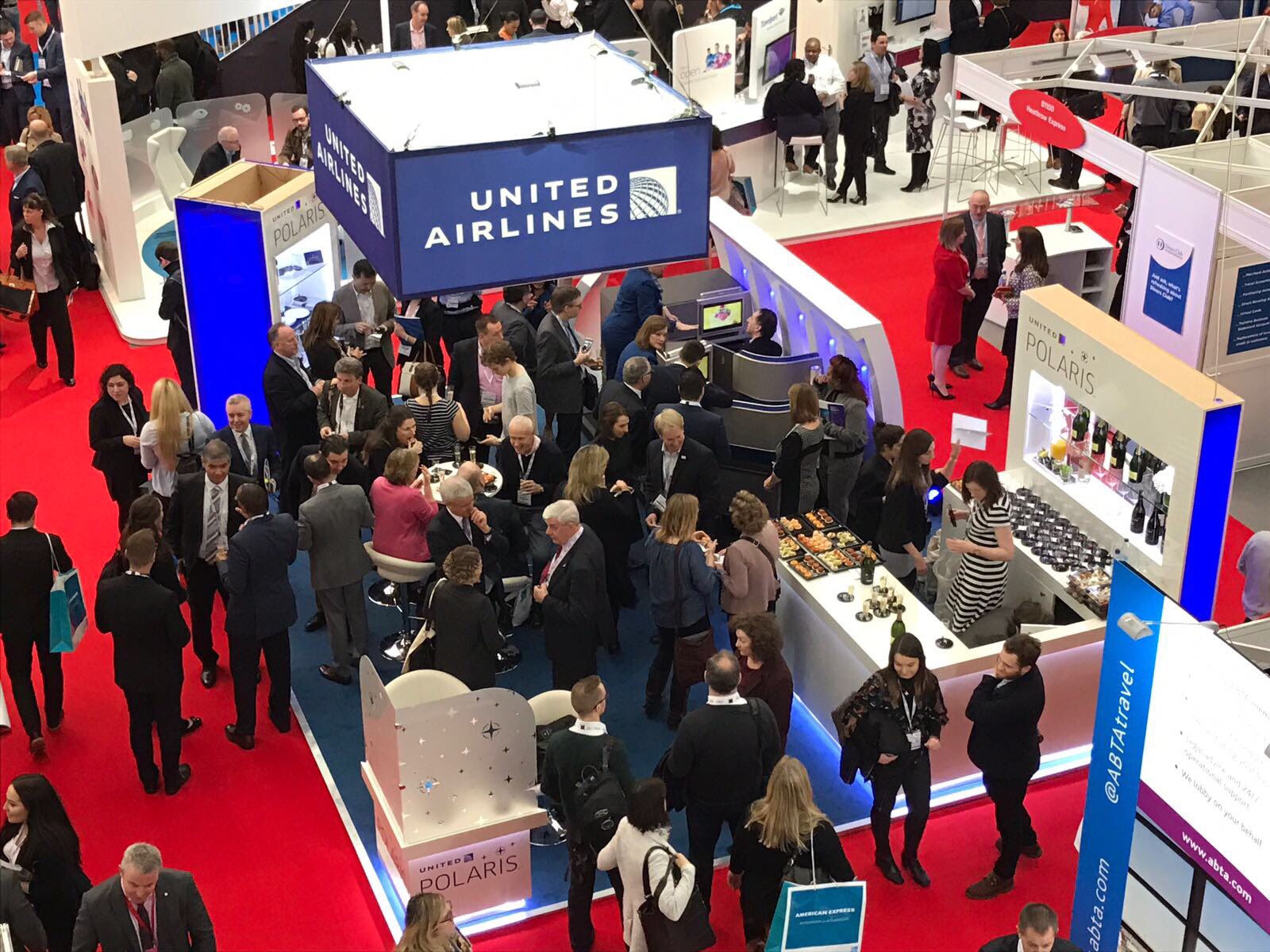
Noticed a billboard on the way to work this morning that had "United Airlines" next to the globe logo rather than just "United" and the font was slightly different.
Apparently this new branding is popping up in other places as well?
I'll see if I can get a picture this afternoon but has anyone else seen it?
Apparently this new branding is popping up in other places as well?
I'll see if I can get a picture this afternoon but has anyone else seen it?

 Mar 1, 2017, 1:21 am
#4
Join Date: Mar 2013
Location: BDL/NYC/BOS
Programs: UA/*A Gold, Global Entry, Marriott Plat, Hilton+IHG Gold, Hertz PC, DL
Posts: 1,752
i think the marketing team still feels insecure sponsoring events and only referring to the company as "united", so there are a couple bizarre modified logos floating around (in the current, all caps and globe style) that say "UNITED AIRLINES".
i think it looks cheesy, and takes away from the brand. i don't see current-gen "delta air lines" branding being used by DL.
here's an example that was tweeted by the @united account yesterday:

another variation:

i think it looks cheesy, and takes away from the brand. i don't see current-gen "delta air lines" branding being used by DL.
here's an example that was tweeted by the @united account yesterday:
another variation:
Mar 1, 2017, 1:31 am
#5
Join Date: May 2010
Location: AVP & PEK
Programs: UA 1K 1.8MM
Posts: 6,349
So, they use a modified "UNITED AIRLINES" logo when it's not necessarily an audience that recognizes the brand, so the added "AIRLINES" makes that clear? Must be their logic there.
I can sort of understand that reasoning, although also find it a bit cheesy.
Mar 1, 2017, 1:55 am
#6
Join Date: Jan 2013
Location: LA
Posts: 1,281
Either way way looks like the marketing brand standards team needs to get on it with ensuring proper logo usage out there. Guess we can lump this team into their wonderful IT team as well.
 Mar 1, 2017, 10:40 am
#9
FlyerTalk Evangelist
Join Date: Feb 2002
Location: San Francisco/Tel Aviv/YYZ
Programs: CO 1K-MM
Posts: 10,762
Mar 1, 2017, 10:48 am
#10
Join Date: Jul 2011
Location: Our Nation's Capital
Programs: UA 1K, Marriott BonVoy LT Titanium Elite, National Executive Elite
Posts: 832
Mar 1, 2017, 10:50 am
#11
Join Date: Jan 2005
Location: New York, NY
Programs: UA, AA, DL, Hertz, Avis, National, Hyatt, Hilton, SPG, Marriott
Posts: 9,452
Right... old United never had to formally identify itself as "United Airlines"... everyone instantly recognized the Tulip and its connotation of quality and magnificent customer service!  I kid, I kid, but see...


Anyway, the logotype that is the subject of this discussion seems to also appear in some cases where the design is heavy on symmetry, such that the globe is positioned in the center of 'United' and 'Airlines' along some axis in the design... see the NYC Half Marathon logo above, or the adaptation for the United Center.
In most cases these are third-party applications, not direct United publications or installations.
I kid, I kid, but see...Anyway, the logotype that is the subject of this discussion seems to also appear in some cases where the design is heavy on symmetry, such that the globe is positioned in the center of 'United' and 'Airlines' along some axis in the design... see the NYC Half Marathon logo above, or the adaptation for the United Center.
In most cases these are third-party applications, not direct United publications or installations.
Last edited by EWR764; Mar 1, 2017 at 11:01 am
Mar 1, 2017, 11:49 am
#13
FlyerTalk Evangelist
Original Poster
Join Date: Feb 2007
Location: PDX
Programs: UA 1K, Marriott Plat
Posts: 11,500
i think the marketing team still feels insecure sponsoring events and only referring to the company as "united", so there are a couple bizarre modified logos floating around (in the current, all caps and globe style) that say "UNITED AIRLINES".
i think it looks cheesy, and takes away from the brand. i don't see current-gen "delta air lines" branding being used by DL.
here's an example that was tweeted by the @united account yesterday:
i think it looks cheesy, and takes away from the brand. i don't see current-gen "delta air lines" branding being used by DL.
here's an example that was tweeted by the @united account yesterday:
Thanks for posting that image. It was pretty much exactly like this. The font looked a little different but that could have been where I was at in relation to the sign.
What's funny is that no one calls them "United Airlines" from what I've heard here (PDX) and even the signage at the airport is simply "United".
Mar 1, 2017, 12:25 pm
#14
Join Date: Oct 2015
Location: SFO
Programs: UA GS 1MM / Hilton Diamond / Bonvoy Gold / Hertz PC
Posts: 396
Mar 1, 2017, 12:44 pm
#15
Join Date: Jan 2005
Location: New York, NY
Programs: UA, AA, DL, Hertz, Avis, National, Hyatt, Hilton, SPG, Marriott
Posts: 9,452

Saul Bass stylized it to look like a "U", using United's red/blue colors, and allegedly referenced the four time zones of the continental USA by way of the vertical stripes. A classic, iconic design that sadly isn't coming back any time soon... seven years on perhaps it's time for us to move forward!
Similarly, Saul Bass designed Continental's "contrails" logo, otherwise known as a "meatball" (also applied to Pan Am and other round airline logos of the day). The logo is a stylized 'C' and is evocative of the contrails of a 707. Again, classic stuff.