


 Nov 30, 2017, 8:41 am
Last edit by: JDiver
Some ways to reverse new features
1) Disabling infinite scroll:
2) Restore previous post editing options:
NOTE: For ease of both members posting and Technical Support, this thread has been split into two threads for 2018; one exclusively for MOBILE devices, the other for DESKTOP devices. You can find them here:
2018 FT Nov 2017 Upgrade for DESKTOP Devices BUG REPORTS (link), and
2018 FT Nov 2017 Upgrade for MOBILE Devices BUG REPORTS
1) Disabling infinite scroll:
- Go to My FlyerTalk Control Panel
- Edit options
- Disable Infinite Scroll
- Edit options
2) Restore previous post editing options:
- Go to My FlyerTalk Control Panel
- Settings and Options
- Miscellaneous Options
- Message Editor Interface and select �Standard Editor -- extra formatting controls� (you may see odd behavior in this unsupported editor)
- Miscellaneous Options
- Settings and Options
NOTE: For ease of both members posting and Technical Support, this thread has been split into two threads for 2018; one exclusively for MOBILE devices, the other for DESKTOP devices. You can find them here:
2018 FT Nov 2017 Upgrade for DESKTOP Devices BUG REPORTS (link), and
2018 FT Nov 2017 Upgrade for MOBILE Devices BUG REPORTS

ARCHIVE: FT 15 Nov 2017 Upgrade Tech Thread - 2017 BUG REPORTS
Nov 16, 2017, 6:59 am
#331
FlyerTalk Evangelist


Join Date: Feb 1999
Location: Seat 1A, Juice pretty much everywhere, Mucci des Coins Exotiques
Posts: 34,339
 Nov 16, 2017, 7:17 am
#332
Join Date: Nov 2007
Location: SW London
Programs: BAEC Silver; Hilton Diamond;a miscellany of other hotel non-statuses
Posts: 3,607
Nov 16, 2017, 7:18 am
#333
FlyerTalk Evangelist
Join Date: Jun 2002
Location: n.y.c.
Posts: 13,988
Good God.
What a mess. This looks like 1996.
What a mess. This looks like 1996.
Nov 16, 2017, 7:28 am
#335
Join Date: Aug 2007
Location: Truth or Consequences, NM
Programs: HH Diamond, Marriott Titanium, Hertz President's Circle, UA Silver, Mobile Passport Unobtanium
Posts: 6,192
I have to admit, this is about as ugly of a layout as it gets.
Nov 16, 2017, 7:34 am
#336
Join Date: Feb 2017
Location: Everywhere and Nowhere
Programs: DL GM
Posts: 515
Yeah but do you want an American Express?
Incredibly, I am still not seeing any ads on any page despite all Ad and Script Blockers off. Rest assured though, if I was staring two banner ads in the face before even getting to a single word of content, I would be waging war with every Ad and Script blocker known to man.
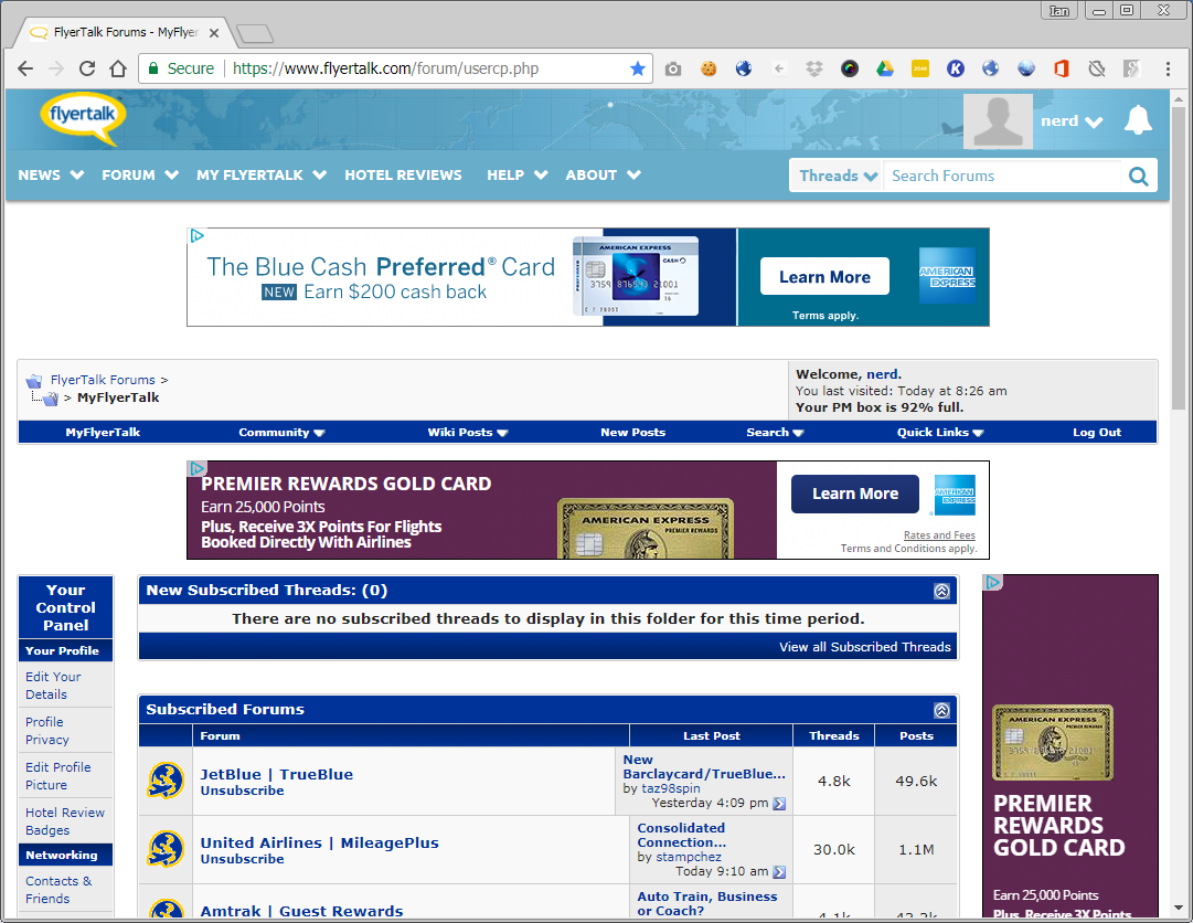
The formatting issues in this single screenshot alone are hilarious. I said it a few pages back but this looks like those old free ProBoards anyone could make with just the most basic code. I mean in this one screen shot you have:
1) Ads taking up far more space than any actual content
2) The ad on the right is twice the width of the Control Panel
3) All the navigation images have non-transparent backgrounds that don't actually match their background
4) Whatever the hell is happening to the last post box for the Jet Blue forum
5) You're scrolled all the way up with no apparent zoom on and the first actual website content you see on the page is in the lower 1/4 of it, not even three full lines
6) Just the most embarrassing mid-late 90s looking UI and look
This is embarrassing. I'd say this is the type of web design you see from a high school freshman level computer/web design course, but that would be insulting to high school freshmen who would at least have the common sense to not make an entirely white website.
Incredibly, I am still not seeing any ads on any page despite all Ad and Script Blockers off. Rest assured though, if I was staring two banner ads in the face before even getting to a single word of content, I would be waging war with every Ad and Script blocker known to man.
The formatting issues in this single screenshot alone are hilarious. I said it a few pages back but this looks like those old free ProBoards anyone could make with just the most basic code. I mean in this one screen shot you have:
1) Ads taking up far more space than any actual content
2) The ad on the right is twice the width of the Control Panel
3) All the navigation images have non-transparent backgrounds that don't actually match their background
4) Whatever the hell is happening to the last post box for the Jet Blue forum
5) You're scrolled all the way up with no apparent zoom on and the first actual website content you see on the page is in the lower 1/4 of it, not even three full lines
6) Just the most embarrassing mid-late 90s looking UI and look
This is embarrassing. I'd say this is the type of web design you see from a high school freshman level computer/web design course, but that would be insulting to high school freshmen who would at least have the common sense to not make an entirely white website.
Nov 16, 2017, 8:06 am
#337
Join Date: Jul 2009
Programs: BAEC Silver, IHG Diamond
Posts: 7,757
Constant lock ups due to script errors in IE11.
Sometimes every few seconds in this thread especially.
Works fine on my phone although the forum selection page looks like the desktop rather than the mobile version.
Can have the same advert stacked twice at the top of the screen and again at the bottom.
Generally prefer the old look. Too much like British Airways' lipstick on a pig upgrade recently.
 Nov 16, 2017, 8:24 am
#338
A FlyerTalk Posting Legend
Join Date: Aug 2002
Programs: UALifetimePremierGold, Marriott LifetimeTitanium
Posts: 71,107
Wow - so far 99% of the comments are negative. IB is basically saying tough, we'll fix bugs but the 1995 version we just provided to you/"enhanced" is what you're stuck w/ because the Overlords (IB's phrase) want the new version which supposedly works on IB's other sites - even though IB's other sites are nothing like FT. So keep on complaining because unless it's a bug, we're (IB) happy with our 1995 not tested version.
A version that has such universal dislike & also is encouraging FTers to either quit/lessen posting - or go to IB's competitors can not be the result that IB wanted, unless IB is counting on FT continuing to crop up in searches & think it will continue to do so moving forward so it doesn't care about long-time posters leaving. However, if people discover FT via search & then are turned off by the formatting/1995 layout they may decide to not stick around either, which again doesn't help IB.
I've been on FT for 15 years. Some of the changes that have been made are ok; some have been eh, really, why did you think this was a good idea. But THIS 'enhancement' may actually be the one that gets me posting less on FT & going to its competitors to post instead. As someone w/ 60,000+ posts & a 15 year history w/ FT, thanks IB - not.
On a dif note (and just addressing one of the issues people have problems w/). IB had a 'white space' issue w/ a prior 'enhancement' & they were able to get it fixed. I don't believe that they can't fix this one.
Nov 16, 2017, 8:26 am
#339
FlyerTalk Evangelist
Join Date: Apr 2009
Location: where lions are led by donkeys...
Programs: Lifetime Gold, Global Entry, Hertz PC, and my wallet
Posts: 20,340
I find it extremely appropriate that the latest Flyer talk email is titled:
Brace Yourselves. Devaluation Is Coming.
Perfect timing.
Brace Yourselves. Devaluation Is Coming.
Perfect timing.
Nov 16, 2017, 8:45 am
#340
Join Date: Jun 2008
Location: Northern Nevada
Programs: DL,EK
Posts: 1,652
Does anyone know of another forum somewhere else on the internet that is similar to FlyerTalk? This site just does not work at all and I can't see coming back here often.
Nov 16, 2017, 8:50 am
#341
Join Date: Feb 2003
Location: On strike
Posts: 8,135
Wow - so far 99% of the comments are negative. IB is basically saying tough, we'll fix bugs but the 1995 version we just provided to you/"enhanced" is what you're stuck w/ because the Overlords (IB's phrase) want the new version which supposedly works on IB's other sites - even though IB's other sites are nothing like FT. So keep on complaining because unless it's a bug, we're (IB) happy with our 1995 not tested version.
A version that has such universal dislike & also is encouraging FTers to either quit/lessen posting - or go to IB's competitors can not be the result that IB wanted, unless IB is counting on FT continuing to crop up in searches & think it will continue to do so moving forward so it doesn't care about long-time posters leaving. However, if people discover FT via search & then are turned off by the formatting/1995 layout they may decide to not stick around either, which again doesn't help IB.
I've been on FT for 15 years. Some of the changes that have been made are ok; some have been eh, really, why did you think this was a good idea. But THIS 'enhancement' may actually be the one that gets me posting less on FT & going to its competitors to post instead. As someone w/ 60,000+ posts & a 15 year history w/ FT, thanks IB - not.
One thing I can't help wondering: did IB bother talking to any actual FT users before developing/implementing this atrocity? I'm guessing not.
And to be clear, I'm not talking about asking users "do you like this update color or this one?" I'm referring to something far more fundamental: asking users how they use the site on a day-to-day basis. (In other words, UX.)
AFAIK, IB has never asked us this fundamental question, so I'm going to propose that we start telling them. This thread isn't the right place IMO, so I'm happy to hear suggestions on where such a thread might go. I imagine the comments would answer questions like these:
- When you visit FT, what's your entry point? My FT page, site home page, or something else?
- What does a typical site visit look like for you? How do you decide what to read or browse first?
- Do you use the thread/forum subscription capability? If so, is this a primary mechanism or supplementary?
- How actively do you manage your subscriptions?
- Which forums are run well IYO? Which forums are moderated poorly? In what respect(s)? [with safe harbor from FT rules as long as comments are constructive]
- Which site features don't work as you'd like?
- What missing features would you like to see added?
- Which features do you never use at all? Why not?
Nov 16, 2017, 8:52 am
#342
FlyerTalk Evangelist
Join Date: Mar 2008
Location: DFW
Posts: 28,092
Apparently pushing more ads was the goal, not making the FT user friendly.
Text size (like here) is to small and with all the blue bars and stuff doesn't have enough contrast to stand out. Very hard to read.
Can't believe this mess was beta tested before being shoved down our throats. FAIL!
Nov 16, 2017, 9:10 am
#343
Administrator
Join Date: Sep 2015
Location: Los Angeles
Programs: Internet Brands
Posts: 3,867
What browser are you using? And desktop or mobile? I was able to post a photo URL from wikipedia OK, but want to test more. Were you using Quick Reply or Advanced?
 seems to be broken. I can't paste an image URL into it no matter what I try. I'm using Chrome.
Nov 16, 2017, 9:12 am
seems to be broken. I can't paste an image URL into it no matter what I try. I'm using Chrome.
Nov 16, 2017, 9:12 am
#344
FlyerTalk Evangelist
Join Date: Apr 2009
Location: where lions are led by donkeys...
Programs: Lifetime Gold, Global Entry, Hertz PC, and my wallet
Posts: 20,340
Post reply left justifies - deliberate or bug?
Font in reply box is stupid small - deliberate or bug?
If deliberate, why?
If bug, please fix.
Font in reply box is stupid small - deliberate or bug?
If deliberate, why?
If bug, please fix.
Nov 16, 2017, 9:13 am
#345
Administrator
Join Date: Sep 2015
Location: Los Angeles
Programs: Internet Brands
Posts: 3,867
 . I liked the yellow.