"Flying Colors" Identity Theme Going Away? Upcoming New Livery...
#121
Moderator: Hilton Honors forums
Join Date: Dec 2002
Location: Marietta, Georgia, United States
Posts: 24,997
My guess is that the distinct shade difference is to evoke the sun shining on the �widget�, creating the shadow effect. Note how the lighter portion of the �widget� is �facing� the sun as though it were exposed to it.
Of course, for most of a flight, the �widget� will be �exposed to the sun�. This effect may not work as well on a cloudy or rainy day while the aircraft is at the gate...
#122
FlyerTalk Evangelist
Join Date: Oct 2005
Location: Somewhere between here and there...
Programs: WWF, Appalachian Mountain Club
Posts: 11,595
Hmm. I'm not totally opposed to it, but I'd say keep that one in mind and keep looking for a bit.
#123
Join Date: Apr 2006
Programs: Delta FO
Posts: 40
I just dont see how this is in line with the new marketing look of the ticket jackets, ads, signage, etc. that has been rolled out recently. Im almost in disbelief that this is what the creative design team came up with...it looks gloomy and unfinished. (which Im hoping it is, at least the latter!)
Last edited by idtm; Apr 6, 2007 at 8:44 pm Reason: Claification
#124
Join Date: Jul 2004
Programs: DL; AA; UA; CO; LHLX; NZ; QR; EK; BA
Posts: 7,407
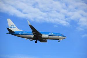
That tail has GOT to GO...why are airlines now into mutilating their logos on tails (is this the new "Eurowhite" trend?) Air India's new tail on their 777s chops off part of the logo; UA's new one chops off parts of the "U", and now we have this mutilated Widget...except for us FFers and other die-hard DL fans who instantly recognized the Widget on the tail, how does the casual flyer even know, just by looking at the tail that that red thing is supposed to be a widget? The whole point of a tail design on an airplane is to inspire immediate recognition of a brand....this half-inverted chopped-off widget on the tail does no such thing, I'm afraid....


#125
In memoriam
Join Date: May 2005
Location: DAL
Programs: SWA A list preferred and CP, Hilton Lifetime Diamond, Hertz President's club
Posts: 9,803
That could be possible.
My guess is that the distinct shade difference is to evoke the sun shining on the “widget”, creating the shadow effect. Note how the lighter portion of the “widget” is “facing” the sun as though it were exposed to it.
Of course, for most of a flight, the “widget” will be “exposed to the sun”. This effect may not work as well on a cloudy or rainy day while the aircraft is at the gate...
#126
Moderator: Hilton Honors forums
Join Date: Dec 2002
Location: Marietta, Georgia, United States
Posts: 24,997
All I saw was a �widget� split into two different colors � not just shades.
_______________________________
For what it is worth, I do like the new look, but I am reserved about it. The observations that I am imparting about the new look are just that: observations based on a cursory look on my part. I do not necessarily agree with everything about the new look, but I do believe it is a step in the right direction.
#127
In memoriam
Join Date: May 2005
Location: DAL
Programs: SWA A list preferred and CP, Hilton Lifetime Diamond, Hertz President's club
Posts: 9,803
Well, I can tell you that, like you and others, I did not get the �three-dimensional� look at first glance.
All I saw was a �widget� split into two different colors � not just shades.
_______________________________
For what it is worth, I do like the new look, but I am reserved about it. The observations that I am imparting about the new look are just that: observations based on a cursory look on my part. I do not necessarily agree with everything about the new look, but I do believe it is a step in the right direction.
#128
Join Date: Aug 2004
Location: USA, Europe
Programs: DL Plat, NW Plat(x2), BMI Gold, IC Ambassador, etc
Posts: 1,685
That tail reminds me of NW. Maybe there's stuff cooking as always..
#129
Original Poster
Join Date: Aug 2001
Location: Wayne, PA USA
Programs: DL MM, Marriott Bonvoy Lifetime Titanium, HHonors Gold
Posts: 7,242
Actually, I love the new scheme. The only thing I would change (as I said in the other thread) is the widget "pointing" "NorthWest". I'd have gone with a straight-up widget, bleeding off the edges of the tail. Otherwise, it's very classy and elegant (and thank GOD they got rid of the stupid "typewriter" font!)
#130
Join Date: Mar 2002
Location: Birmingham, AL (weekdays) and Atlanta, GA (weekends)
Programs: DL Platinum Medallion
Posts: 590
Dang, the photo's gone. Could someone repost?
#131
Original Poster
Join Date: Aug 2001
Location: Wayne, PA USA
Programs: DL MM, Marriott Bonvoy Lifetime Titanium, HHonors Gold
Posts: 7,242
Yes great song http://www.youtube.com/watch?v=6KzqqRVQqzk
The song alone, still sounds like a funeral dirge to me.
#132
Original Poster
Join Date: Aug 2001
Location: Wayne, PA USA
Programs: DL MM, Marriott Bonvoy Lifetime Titanium, HHonors Gold
Posts: 7,242
I agree � especially on the old Boeing 747 aircraft, as the �widget� looked awkward on the tail.Due to the shape of the tail, the bleed effect that you like would not work nearly as well on the tail had the new �widget� been in its proper orientation.
Trust me on this one...
Trust me on this one...
#133
FlyerTalk Evangelist
Join Date: Nov 2004
Location: 45� North
Programs: DL DM MM, HH Diamond
Posts: 10,196
After spending some time digesting the new livery, I sorta like it. I think it looks sharp. I would really like to see it in real life though.
#134
Join Date: Jun 2003
Location: Atlanta
Programs: DL/PM, *Wood Platinum
Posts: 835
Yes, please!!! I'd like to see what all the fuss is about. For the record, I also liked the Flying Colors motif--I thought it was VERY classy, unfussy, understated and original. I await a glimpse of this new livery with fear and trepidation--seems like no one likes it! 
PS. At least I gather from what it being said that it is not a predominantly blue tail--I've noted at international airports around the world that blue tails seem to be all the rage--I find them boring.
PPS. I like the "adieumus" song (the dancer is gorgeous) but I'm not sure it says "air travel" to me...it has a slightly upscale hotel-chain feel about it. Rhapsody in Blue was a brilliant choice for United, I thought. Slightly frenetic...very American...really evoked business travel for me.
#135
Join Date: Jun 2002
Location: Kingdom of the Sun
Programs: DL GM/MM
Posts: 3,708
What a disappointment to wake up to.....I'm hoping this is just the first in a series of design models.
A giveaway is there's no registration number on the aircraft.
A giveaway is there's no registration number on the aircraft.
