"Flying Colors" Identity Theme Going Away? Upcoming New Livery...
#136
Join Date: Sep 2003
Location: VPS
Programs: DL DM/2MM, Etihad Gold, HHonors Diamond, SPG Gold
Posts: 4,787
#137
Join Date: Jun 2002
Location: Kingdom of the Sun
Programs: DL GM/MM
Posts: 3,708
I didn't see the model setup at first but noticed the lack of number on the "first" photo. Otherwise it was very difficult to tell it was a model unless one was looking very carefully.
#138
Join Date: Dec 2004
Location: ATL
Programs: Delta
Posts: 518
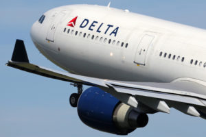
I think this livery will look nice when it is finally actually painted on an aircraft. It seems like there's always some complaining on any livery that Delta has. This is probably nothing new to them.
Remember, this livery is simple. It will not cost as much to apply as something like the current Waving Fabric design does. The undercarriage will not need that reflection on it, which must take time.
Remember, this livery is simple. It will not cost as much to apply as something like the current Waving Fabric design does. The undercarriage will not need that reflection on it, which must take time.
#140
In memoriam
Join Date: May 2005
Location: DAL
Programs: SWA A list preferred and CP, Hilton Lifetime Diamond, Hertz President's club
Posts: 9,803
Not if the 3-dimensional widget was resting on a solid blue background.
Actually, I love the new scheme. The only thing I would change (as I said in the other thread) is the widget "pointing" "NorthWest". I'd have gone with a straight-up widget, bleeding off the edges of the tail. Otherwise, it's very classy and elegant (and thank GOD they got rid of the stupid "typewriter" font!)
Actually, I love the new scheme. The only thing I would change (as I said in the other thread) is the widget "pointing" "NorthWest". I'd have gone with a straight-up widget, bleeding off the edges of the tail. Otherwise, it's very classy and elegant (and thank GOD they got rid of the stupid "typewriter" font!)
If they truly wanted the widget to "pop" as 3d the flatness of the blue is working against them
#141
In memoriam
Join Date: May 2005
Location: DAL
Programs: SWA A list preferred and CP, Hilton Lifetime Diamond, Hertz President's club
Posts: 9,803
Well if it is one in a series they wanted to test I think they got their feedback on this one...KILL IT! Next model?
#142
Join Date: May 2006
Location: NYC
Programs: Delta DM/2MM, Flying Blue Gold, Hertz Platinum
Posts: 1,934
Notice how they shot a former Song plane (N67171) being painted into the Flying Colors livery...
I bet they're going to reverse the process in the ad and show that plane in the hangar (with Flying Colors), then show the painters doing their thing, and then unveil the new livery (which was actually a model because they didn't have the real thing yet). Problem is, the model is a 763ER and Ship 6717 is a 752. It'll be interesting to see how the ad is written and produced.
And by the way, I think the idea that the model is just one in a series of final designs... is wishful thinking. They would never go to the expense of hiring a union film crew and have them shoot this elaborate scene... if it were not the actual livery.
#143
Join Date: Jun 2003
Location: Atlanta
Programs: DL/PM, *Wood Platinum
Posts: 835
Okay...I've finally seen it (at http://www.airliners.net/discussions...n/3346039/1/#1 post #224 illustrates it on a 777). It is pretty staid and dignified and BORING. I think it might have been a bit more exciting if the colors were less saturated and a bit brighter...maybe if the tail were white and the widget's lower section was in blue and the upper section in red. It would look much more graphic. Right now it just looks somber and an attempt at "artsy" that doesn't quite come off...
#144
In Memoriam
Join Date: Jul 2001
Posts: 35,555
Actually, I have always loved the flying colors scheme.
#145
Join Date: Oct 2006
Location: Sunny Florida
Programs: SPG Platinum
Posts: 759
OMG that is soooo ugly and boring.
It absolutely goes against what I thought Delta's new image was trying to portray. The new uniforms are trendy and hip with brightness, the VRT was very upbeat and fun, the employee attitude has been more upbeat...but this paint scheme is "dead beat" and boring.
It definately looks like Air Canada.
It absolutely goes against what I thought Delta's new image was trying to portray. The new uniforms are trendy and hip with brightness, the VRT was very upbeat and fun, the employee attitude has been more upbeat...but this paint scheme is "dead beat" and boring.
It definately looks like Air Canada.
#146
FlyerTalk Evangelist
Join Date: Nov 2004
Location: 45� North
Programs: DL DM MM, HH Diamond
Posts: 10,196
Originally Posted by AJC
He said a working version features an all-red version of the logo on navy blue tails. The triangular logo — currently red, white and blue — also gets a new three-dimensional look but doesn't change its basic shape, the employee said.
#147
In memoriam
Join Date: May 2005
Location: DAL
Programs: SWA A list preferred and CP, Hilton Lifetime Diamond, Hertz President's club
Posts: 9,803
I think it might have been a bit more exciting if the colors were less saturated and a bit brighter...maybe if the tail were white and the widget's lower section was in blue and the upper section in red. It would look much more graphic. Right now it just looks somber and an attempt at "artsy" that doesn't quite come off...
Me too, love seeing a row of the current tails. It is Delta!!
#148
Join Date: Aug 2000
Posts: 1,739
I'm amazed that people seem to care so much about the design of the paint job or FA uniforms. IMHO neither factor adds anything to the flying experience.
I don't really care what paint scheme DL uses given two things:
1. They adopt a design which is as cheap as possible to apply and which will hold up well while looking presentable.
2. They only repaint the planes as needed.
Does anyone know how much money DL has wasted over the years repainting planes or redesigning uniforms in order to put a personal stamp of a particular executive on the enterprise? Maybe it is not as much as I think, but it is certainly more than it should have been. One thing is clear to me; when ranking priorities for DL's limited financial resources, this cannot be anywhere near the top of the list.
#149
In memoriam
Join Date: May 2005
Location: DAL
Programs: SWA A list preferred and CP, Hilton Lifetime Diamond, Hertz President's club
Posts: 9,803
I'm amazed that people seem to care so much about the design of the paint job or FA uniforms. IMHO neither factor adds anything to the flying experience.
I don't really care what paint scheme DL uses given two things:
1. They adopt a design which is as cheap as possible to apply and which will hold up well while looking presentable.
2. They only repaint the planes as needed.
Does anyone know how much money DL has wasted over the years repainting planes or redesigning uniforms in order to put a personal stamp of a particular executive on the enterprise? Maybe it is not as much as I think, but it is certainly more than it should have been. One thing is clear to me; when ranking priorities for DL's limited financial resources, this cannot be anywhere near the top of the list.
I don't really care what paint scheme DL uses given two things:
1. They adopt a design which is as cheap as possible to apply and which will hold up well while looking presentable.
2. They only repaint the planes as needed.
Does anyone know how much money DL has wasted over the years repainting planes or redesigning uniforms in order to put a personal stamp of a particular executive on the enterprise? Maybe it is not as much as I think, but it is certainly more than it should have been. One thing is clear to me; when ranking priorities for DL's limited financial resources, this cannot be anywhere near the top of the list.
#150
Join Date: Aug 2000
Posts: 1,739
Huh? The failure of "new coke" had to do with the formula of what they put in the can, not the can design. You couldn't have chosen an example which demonstates my point more clearly!
