


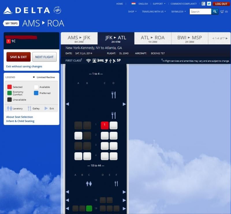
New Seating Map
 Jun 19, 2014, 11:04 am
#31
FlyerTalk Evangelist
Join Date: Nov 2000
Location: Nashville -Past DL Plat, FO, WN-CP, various hotel programs
Programs: DL-MM, AA, SW w/companion,HiltonDiamond, Hyatt PLat, IHF Plat, Miles and Points Seeker
Posts: 11,072
One would think that they tried this out on a bunch of people before moving forward with it. Unless all the "testers" were corporate YES people.... I just don't get it.
I am trying to like it, but I find it hard to read/visualize.
Oh well.
I am trying to like it, but I find it hard to read/visualize.
Oh well.
 Jun 19, 2014, 11:13 am
#32
Join Date: Nov 2008
Location: SAN
Programs: DL PM
Posts: 428
For the colorblind among us, I have to say this is much harder to look at. The contrast (through different eyes I'll admit) is way lower making it tougher to distinguish. The added armrest grey and blare of the white plane body make it busier for those of us who find a simpler scheme helpful.
Function wise this won't change anything in terms of choosing seats but I'm not a fan of the look.
Function wise this won't change anything in terms of choosing seats but I'm not a fan of the look.
Jun 19, 2014, 11:21 am
#33
FlyerTalk Evangelist
Join Date: Apr 2009
Location: Bye Delta
Programs: AA EXP, HH Diamond, IHG Plat, Hyatt Plat, Marriott Plat, Nat'l Exec Elite, Avis Presidents Club
Posts: 16,263
Wow, the new maps are fugly. It's nice they finally show the staggered BE seats on the 767s, but they could have done that without this uglification...
 Jun 19, 2014, 11:21 am
#34
FlyerTalk Evangelist
Join Date: Nov 2009
Location: SEA (the REAL Washington); occasionally in the other Washington (DCA area)
Programs: DL PM 1.57MM; AS MVPG 100K
Posts: 21,356
It's more detailed, that's nice. The choosen colours are very bright. Personally i may prefer somewhat more bleached colours.
One observation;
With the new seat maps in place, i now have, for one of my upcoming trips, an undefined Boeing 757 type seatmap with fully flat bed and direct aisle access that doesn't excist at all on
https://www.delta.com/content/www/en.../Aircraft.html
:
One observation;
With the new seat maps in place, i now have, for one of my upcoming trips, an undefined Boeing 757 type seatmap with fully flat bed and direct aisle access that doesn't excist at all on
https://www.delta.com/content/www/en.../Aircraft.html
:


 Jun 19, 2014, 12:19 pm
#36
Join Date: Mar 2013
Location: PVU, SLC
Programs: DL Pork Medallion, PP, GE
Posts: 1,657
I think it's uuuuuuuuuuuugly. It sort of reminds me of the KLM seat maps, except uglier (I don't really care for their color choices, especially the orange and the burgundy/maroon color). I like the concept, but...clearly just a front-end change, as someone mentioned upthread. I especially dislike the high-contrast colors for the seats. I liked the deeper green and blue hues, as well as the deeper background and minimalistic design of the aircraft on the previous seatmaps.
I guess the one thing I do like, and y'all have already pointed it out, is the representation of seat and row alignments.
I guess the one thing I do like, and y'all have already pointed it out, is the representation of seat and row alignments.
Jun 19, 2014, 1:21 pm
#38
Join Date: Aug 2006
Posts: 716
Wow. Everyone's a critic... You honestly preferred the white/blue squares?
Personally, I love the change. There's infinitely more detail about where your seat is located relative to the lavs/galleys/exits, even the offset of the BE seats is finally clear. The detail of which same-number rows are set back from one another will be a great benefit to families traveling.
Personally, I love the change. There's infinitely more detail about where your seat is located relative to the lavs/galleys/exits, even the offset of the BE seats is finally clear. The detail of which same-number rows are set back from one another will be a great benefit to families traveling.
Jun 19, 2014, 1:24 pm
#39
Join Date: Mar 2014
Location: YYZ
Programs: Skymiles GM, UA Silver, Marriott Titanium, National EE, Hertz 5*
Posts: 383
N717FV on a CRJ 700 (YYZ <-> DTW)
The 747 from ICN <-> DTW has no tail #?!
Can't remember if the seat maps had anything about this before, but the staggering of seat rows does help a lot when not travelling solo.
The 747 from ICN <-> DTW has no tail #?!
Can't remember if the seat maps had anything about this before, but the staggering of seat rows does help a lot when not travelling solo.
Jun 19, 2014, 1:48 pm
#41
Join Date: Jul 2013
Location: Gulf Coast
Programs: Hilton Honors Lifetime Diamond; National Car Rental Executive Elite
Posts: 2,318
Jun 19, 2014, 2:17 pm
#42
Join Date: Jan 2008
Location: LEX
Programs: Delta Reserve - PM
Posts: 1,143
Jun 19, 2014, 2:27 pm
#43
Original Poster
Join Date: Apr 2013
Posts: 15
Actually, after the seating maps looks much better when you give it more chance. More glancing? I am convinced that the dark color deemphasizes the seats that are selected actually makes logic sense. I am trying to convince myself.
Jun 19, 2014, 2:31 pm
#44
Join Date: Jun 2013
Programs: DL Plat, Hilton Diamond, Marriott Plat, IHG Plat, Hertz Prez Circle, National Exec
Posts: 1,357
On the scale of things it is pretty trivial, and I'll get used to it. I just liked the simplicity better.
Jun 19, 2014, 2:50 pm
#45
Join Date: Nov 2012
Location: ATL
Programs: Bonvoy Ambassador, Hyatt Globalist, Hilton Gold, AA EXP, UA Silver, former DL DM
Posts: 2,001
While I appreciate having detailed seat maps, using as many as four colors to represent a single occupied seat is simply unnecessary and distracting.
As for the tail numbers -- what purpose do these serve if they are wrong? At best they are amusing, and at worst they are confusing and misinformative.
As for the tail numbers -- what purpose do these serve if they are wrong? At best they are amusing, and at worst they are confusing and misinformative.

